


Attention spans are dwindling by the second. And internet content seems to double within the same amount of time. So, how do you compete with all of the other businesses in your industry when internet users are so quick to jump from one website to another?
Your website needs to be eye-catching and interactive. It needs to give visitors reasons to stay for a while and return again once they leave. It needs a top-notch design in order to impress all of its visitors. So, as the title of today’s blog asks, what are the markings of a top-notch website design?
A distinct colour scheme that reflects your branding.
Blue and orange. Those are the two colours that have been used to represent MeloTel’s branding from day one. To this day, even when we update and revise our marketing materials, the blue and orange colour scheme has never left. This is why our company website incorporates those very colours. As a result, our branding is strengthened and made very easy to recognize.
“This might sound rudimentary, but colour schemes and colour usage are very important when it comes to modern web design,” agrees Baylor Cherry on Blueleadz.com, “A strong colour palette will help create cohesiveness between everything your business puts out. Companies who have both primary and secondary colours have more wiggle room to work with when creating new elements for their website, whether it’s the homepage, landing pages, blogs, or a resource database.”
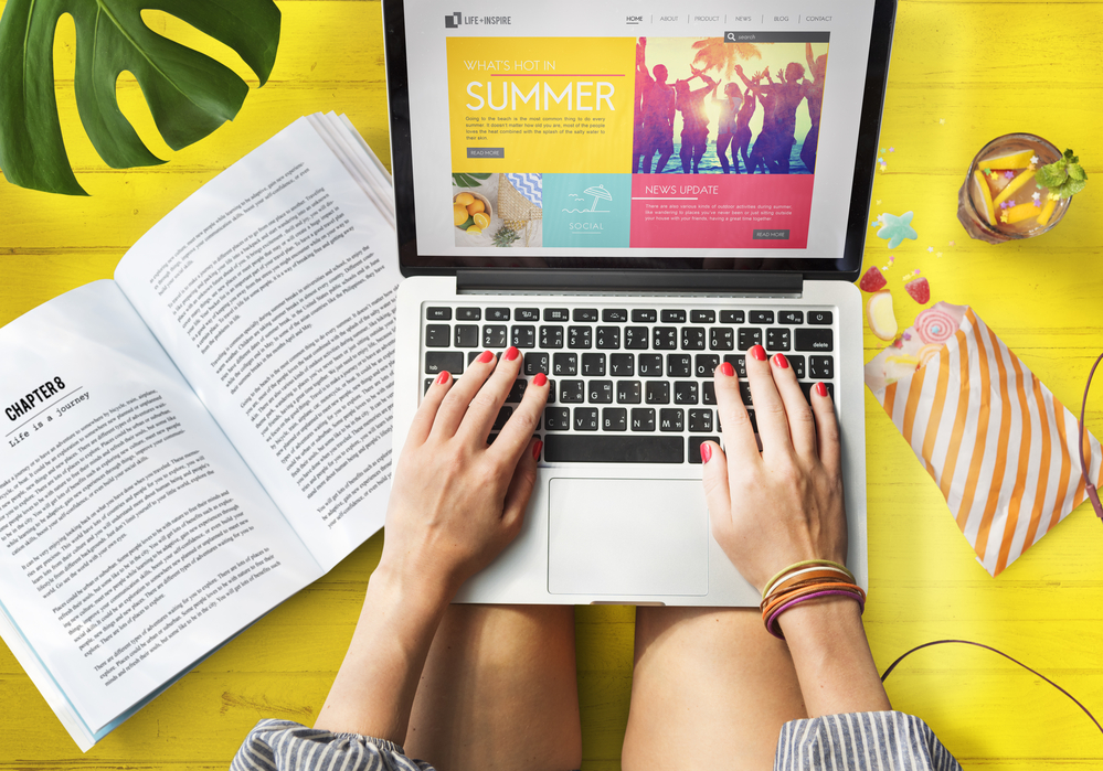
Attention-grabbing images and videos.
In today’s social media-obsessed world, it certainly pays to have eye-catching visuals on your site. Both photos and videos are all the rage, these days, on social media platforms like Instagram, YouTube, Facebook and Twitter. Combine vivid images with the written content on your site to ensure that you’re keeping the attention of its visitors.
On Hubspot.com, Jeffrey Vocell refers to such photos as “hero images”. “Large hero images are also often placed in the background with text and other content overlaid on top, like on Uber’s website,” he explains, “Regardless of the approach you utilize, large images can help visually tell your story without having to rely on just text.”
A clean and sleek look to promote professionalism.
Sometimes, less is more. When internet users visit your website, you want to be sure they aren’t inundated with so much visual stimuli that they are turned off. A little empty space is a key ingredient to a sleek and professional looking website. Cherry points out that empty space (or “white space” which isn’t necessarily white) can be very effective.
“Things should have room to breathe; if your website is crowded, it is very hard to direct the attention of your visitor’s eye,” she writes, “Purposely designing your website with white space makes for a clean design that is easily digestible and organized. As websites are adapting a more minimalistic style, keeping space open on your page will allow your reader to navigate their way around page with more ease.”
Does your company website need some sprucing up? For information about MeloTel’s Website Maintenance Services, please don’t hesitate to contact us at 1-888-MELOTEL or use the Live Chat feature on our website!